Monday, January 28, 2013

Renewable Energy in New Hampshire – Part 1

In this week's post, I am going back to some of the early analysis I did so that we can take a closer look at renewable energy in New Hampshire. As shown in the figure below, about one-tenth of our energy supply comes from renewable energy sources. Transportation - largely ethanol in gasoline -  accounts for 12% of the renewable energy supply, heating for residential and commercial buildings uses 9%, industrial operations, 4%, and three quarters goes directly to the generation of electricity. In fact, renewables make up 15% of the energy that goes into electricity generation in the state.


At this stage, you might be asking yourself "What is in the renewables box?" so let us take a closer look at this. If we pop open the renewable energy box, we find the pie chart below.


By taking a look at the various slices of the renewable pie, we see that energy from burning wood and waste makes up just over half of the renewable energy produced in the state.

I was a little surprised at the large slice of wood and waste, and my first thought was that a lot of this energy comes from the incineration of municipal solid waste (MSW). As it turns out, I could not have been more wrong: MSW incineration is only about 2% of the renewable energy category. The bulk of the wood and waste slice is from the burning of wood and other biomass to generate electricity. It turns out that there are seven wood-burning power plants in the State and two more under construction. These wood burning plants are responsible for three quarters of the wood and waste slice (or 4% of the overall energy consumption in NH). My estimation is that 8% of the total energy input into electricity production is from wood. This is a lot larger than I anticipated and clearly fodder for a future post.
 
The remaining quarter of the wood and waste slice is from the burning of wood and wood pellets in homes and businesses. I, for one, am impressed that the Energy Information Administration, EIA, that put together all this valuable information is able to collect reliable information on firewood and wood pellet sales. A lot of these sales are to individual homeowners, only some of which are sold at retail. A good portion must be from individuals buying and selling truckloads of firewood to one another and, in many cases, even from trees on one's own property. This figure must be extraordinarily difficult to measure or estimate.

Turning back to the pie chart above, we can see that hydropower makes up about one-third of the renewables pie which goes directly into the electricity supply for the state. Corn-based ethanol, which is now part of the gasoline in our automobiles, represents 12% of our renewable energy use. How renewable this food-based energy source actually is, is debatable, but I will take another opportunity in the future to grind that particular axe. Wind is a relatively small component, only about 2% of renewable energy and driven largely by the Iberdrola wind farm in Lempster. With new wind projects underway, this portion will increase in the future. Solar thermal and photovoltaic are a minute fraction and, at this time, geothermal does not even feature in the EIA numbers. However, there are a good number of geothermal applications in the State but these tend to be small-scale residential or commercial-based installations and are thus difficult to track. It could be interesting to review this sometime in the future.

The pie chart shows where we were in 2010 regarding our renewable energy portfolio in New Hampshire. For our state it is largely a lot of wood and hydropower. Next week, in Part 2, I will be taking a look at historical trends in renewable energy and will look at where we might be going and if we should be spending so much time, effort and tax dollars supporting renewables.

 
Until next time, remember to turn off those lights when you leave the room.
Mike Mooiman
Franklin Pierce University
mooimanm@franklinpierce.edu
2/3/2013


Sunday, January 20, 2013

Another View of Statewide Energy Flows in New Hampshire

In this post I want to look at New Hampshire energy flows in a different way, without resorting, as I have in previous posts, to column charts and criss-crossing cobwebs of arrows. Instead, I would like to introduce the concept of Sankey, or flow, diagrams which are often used in the energy industry. In these diagrams the magnitude of the flow of energy is indicated by the width of the arrow. These diagrams were first used in the energy field by an Irish engineer and captain in the British army, Matthew Henry Phineas Riall Sankey in 1898 to illustrate energy flows in steam engines. A modern version of a Sankey diagram is shown in the next figure. This figure neatly shows how input energy into a steam engine is lost to smoke, friction and a large portion to the steam condensation step. The condensed water is then recirculated to be heated into steam again, hence the small recirculating flow. Useful energy as forward motion of the steam engine and a small amount going to the alternators is shown as the exiting blue flows.


The great thing about Sankey diagrams is that they are not restricted to only energy flows. They can be applied to quantities of many types. For example, material and cost flows are often depicted. One of the most famous of these flow diagrams is that prepared by the French engineer George Charles Minard in 1869, shown below. This figure illustrates the fate of Napoleon's army in 1812 -1813 as they progressed through their disastrous Russian invasion. The figure shows, by the width of the lines, the fate of the invading army. Napoleon crossed into Russian with 422,000 men and through attrition, minor skirmishes and some great battles he entered a largely abandoned Moscow with about 100,000 men under his command. He then turned back to return to France: on the way back, starvation, battles and incessant harassment by guerilla forces decimated his army to 10,000 survivors. The harsh winter also took its toll on his men - the line graph below the flow diagram shows the decreasing temperatures encountered on the army's return from Moscow. The diminishing width of the flow is a skillful, albeit rather harrowing, representation of what was happening in the army in the field, the prisoners that were taken and the lives that were lost.


But I digress. Let's return to energy flows. The folks at the Lawrence Livermore National Laboratory (LLNL) annually prepare flow diagrams for the
total flow of energy in the US. These diagrams are particularly useful and informative and they appear in energy-related presentations all over the place. In 2011 LLNL prepared individual diagrams for all 50 states based on 2008 data. To the best of my knowledge, they don't update these state diagrams every year like their total US flow diagram. Nevertheless I thought I would share their 2008 diagram for New Hampshire, shown below, with you.


Much of this figure shows the same information as my previous analysis, but it does so in a more elegant fashion. Off to the left, you can see the energy inputs to the state. These input energies then flow into transportation, homes, offices, stores and industry and a large part of the flow goes into electricity generation. The width of the lines clearly shows the magnitude of the flows. As with my analysis, it can be seen that electricity produces a lot of waste heat and a relatively small portion, 32% according to LLNL, ends up in electricity that is directed to homes, businesses, factories or exported out of state.


What this diagram includes, which my previous analysis did not, is the recognition that a large fraction of the energy that goes into transportation is lost as waste heat rather than motion. According to the LLNL estimates, only 25% goes into motion. They also recognized that a lot of the heat that goes into warming our homes, businesses and factories is lost due to poor insulation, waste and equipment inefficiencies. Their numbers suggest that 35% of the input energy into homes is lost. For commercial operations they estimate 30% of the energy is lost and losses of 20% are encountered in industrial applications. The diagram then neatly combines all the separate waste energy flows into a single value at the right of the diagram which illustrates the rather sobering fact - that, of the 418 trillion BTU energy supply to NH, 270 trillion BTU, or 65%, is lost as waste heat!

While not as dramatic as the fate of Napoleon's army, this single sobering fact that 65% of our energy input is lost provides the best opportunity for managing our energy needs going forward. Investments in higher efficiency equipment, higher mile-per-gallon vehicles and better insulation for our buildings will all serve to reduce the amount of energy wasted. This will reduce our input requirements. Energy supplies, especially those associated with fossil fuels, can be reduced and better managed. In the process we will reduce our carbon emissions as well.

In many respects, this is the most single beneficial thing that you and I can do at present – we can and we must reduce the amount of energy we waste. Yes, alternative energy sources are necessary but, while we are waiting for scientific breakthroughs and large-scale commercial development, we can be taking measures right now to reduce our energy consumption. We as individuals can take action and we can organize to get the organizations we work for to take action. There is lots of help out there. Many companies and non-profits are working in this field and they are making a difference. For example, here in New Hampshire the very focused mission of the Jordan Institute is to reduce energy losses from buildings in the State. They are doing some impressive things to reduce our dependence on fossil fuels. Take a look at their website if you get an opportunity.

We also need to be realistic about these losses. Yes, they are large, but we will never be able to totally eliminate them due to the nature of energy, materials, electricity and the laws of physics. Even so, we are so far away from these physical limits that there is a lot we can do to reduce energy waste.

So there you have it – another way to look at energy flows in the state. Bear in mind that this analysis uses 2008 figures from the Energy Information Administration and does not reflect the rapid switch away from coal that we are presently undergoing. I plan to present an update of the energy flow diagram for NH in a future post but, in the meantime, hopefully I have got you thinking about what you can do avoid energy losses in your home and the building you work in.


Until next time, remember to turn off those lights when you leave the room.


Mike Mooiman
Franklin Pierce University
mooimanm@franklinpierce.edu
1/20/2013


Sunday, January 13, 2013

The New Hampshire Energy Picture – Part 3: What Happens to the Energy that is Supplied to the State?

In my last post we looked at the direct use of energy in the State. We followed the various components of the energy supply into transportation, residential and commercial heating, industrial use and the generation of electricity. However, I also made the point that electricity is not an energy source - it is an energy transfer medium. It is the way we get the energy out of a lump of coal or a nuclear fuel rod so that it can power the coffee maker in our kitchens. I think we can all agree that buckets of coal or enriched uranium in the kitchen do not work well in powering the toaster and microwave. Therefore, if we are to determine the final allocation of energy use in NH, we have to follow the flow of electricity into its final end use: that is the focus of this blog post.
 
Here is the NH Energy picture I have been working through in the last few posts. In the last post we looked at energy flows from the left column to the center one. This week we are going to focus on the energy flow from the center column to the rightmost one.


So let's start off by looking at the largest slice of the center column so we can determine what happens to all the energy that goes into the production of electricity. We note that 224 Trillion BTUs, or 55% of our total energy supply, goes into the production of electricity. The arrows radiating out from the electricity slice tell the following story:

Approximately two thirds of the energy that goes into the production of electricity is lost as waste heat during the energy production and transmission process. If you are not familiar with electricity production, this might be a rather startling fact. It indicates how inefficient transmission and especially the generation of electricity is when only 35% of the energy input ends up as useable electricity in our homes and businesses. This is a result of the physics of the electricity generation process, and since the advent of commercial scale electricity production, engineers and scientists have been working hard to improve conversion efficiencies. The first commercial electricity generating operation was established by Thomas Edison in New York in 1882. Edison's first operation converted less than 2.5% of the energy in coal to electricity. The average coal plant operating today has a conversion efficiency of ~28% and the latest generations of combined cycle coal power plants have conversion efficiencies of the order of 45 to 50%. We have indeed come a long way efficiency-wise, but we cannot escape the fact that electricity generation produces a lot of waste heat. Not only is energy lost in the generation process, but some of it dissipates during transmission where losses are typically of the order of a further 7%.

The other distribution arrows in this figure show us that 7% of the energy that into goes into electricity production ends up as electricity routed to our homes. A similar amount ends up in commercial operations and industrial usage accounts for 3%. Finally, and for me quite interestingly, a significant 17% ends up as electricity that is exported out of state.

To get a better view as to what happens to electricity after its production, I have sliced and diced the data a little differently in the figure below. I have subdivided the tall electricity slice into its two main components – electricity and waste – because I wanted to examine the allocation of generated electricity in the state. The subdivided column shows that the electricity generation slice is one third generated electricity and two thirds waste heat. Now, if you follow the arrows radiating out on the electricity only piece, you can see that, of the electricity generated in the state, 21% is used in our homes, 21% in our commercial operations, 9% is used to drive our factories and an impressive 51% is exported out of state into the New England Electricity Pool.

It is this exported pool of electricity that often gets politicians, ordinary folks and even less ordinary folks worked up into an absolute lather here in New Hampshire. It has been used at various times to justify the closing down of the Seabrook Nuclear power plant, our coal burning plants and even the Northern Pass project. In a future post I will weigh in on this debate but for the moment you should know that my viewpoint is a highly pragmatic one. I believe that as we continue our rather slow transition to renewable energy, we need to draw upon as many different energy sources as we can so that we are not trapped and reliant on one or two energy sources sometime in the future. Diversification in energy supply, just like picking investments, reduces future risk and my focus is on reducing risk and creating a sustainable future for my children.

It is crucial to note that even though we presently export 50% of the electricity produced in the State, this has not always been the case, and it might not be the case in the future. Prior to the Seabrook Nuclear plant, we were net importers of electricity. We are part of a regional and national pool and at this time we are in the good position to be making a positive contribution.


This final figure combines the allocation of the energy that goes into electricity production with the other energy flows we saw in my previous post. From this figure we learn the following:

  • In our homes 71% of our energy comes from fuels, largely fossil fuels, for direct heating applications. The remainder of the energy supplied to our homes is from electricity usage.
  • For our commercial businesses 58% comes from direct heating and 42% from electricity. The higher percentage of electricity use in our commercial operation is likely due to increased use in lighting for displays and air conditioning in the summer.
  • Our factories are more like our homes where 75% of energy use is from direct heating and 25% is from electricity.

Finally, if we examine the percentages in the leftmost column and working from the bottom up we learn that, of the 409 trillion BTU of energy supplied to the state, 36% of it is lost as waste heat during the generation and transmission of electricity, 9% leaves the state as exported electricity, 7% is used to power our factories, and 9% is used to keep our office buildings and stores lit up, warm and air conditioned. Our homes are responsible for 13% of NH's energy appetite and transportation uses up the remaining 26% of our energy supply.

So there you have it. After slogging through three detailed posts you should now have an understanding of NH's energy picture and a good idea of where our energy comes from, how it is used, where it ends up and how much is wasted as a result of electricity generation.

Before I ride off into the power line sunset shown on the background of my blog, some of you might be ready to point out that this picture is not quite complete: if I have shown how much energy is lost as waste heat during electricity generation, I should have done same for the energy used in transportation and that lost from our homes and businesses. I totally agree with you, but that brings in another level of analysis, more complications, more columns and spider webs of arrows and, I think, for the moment, we have all had enough of those. There is a better way to show this and that brings me to the topic of flow diagrams which I will be discussing in my next post.

Let me know if this rather lengthy explanation over the past few posts has helped you understand the statewide energy flows and, as always, I am interested in your opinion.

Until next time, remember to turn off those lights when you leave the room.

Mike Mooiman
Franklin Pierce University
1/13/2012


Sunday, January 6, 2013

The New Hampshire Energy Picture – Part 2: What Happens to the Energy that is Supplied to New Hampshire?


Following on from my last post where we looked at energy supply, I am going to take a look at how we use the energy that comes into New Hampshire. Let's start by taking a look at the New Hampshire Energy picture I presented last time. This is the complicated three column diagram with the cobweb of arrows veering off in all directions. This week we are just going to focus on the first two columns.

 
Our energy supply, generated in the State and imported, is directly used for transportation, for heating residential, commercial and industrial buildings and for producing electricity. Electricity is then used to power our homes, businesses and industry but that is an energy flow pattern that we will be looking at in the next blog post. So let's take a look at the energy flows from the first column to the second.


Even this simplified figure captures a boatload of information. It shows the energy supply, in trillions of BTUs, as well as the percent of each of the components of the total energy supply. In the second column we see how the energy is used for each of the main categories, again in trillions of BTUs, as well as the percentage of total direct use. Our direct energy use falls into four main categories. The bulk of it, 55%, is used to generate electricity which, of course, is then distributed to end users. Transportation sucks up 26% of the energy supply and the remainder goes into heating our buildings with residential and commercial buildings taking up 14% and industrial use absorbing the remaining 5%.

Let's turn our attention now to the arrows and their associated percentages. The arrows show the energy flows from each of the supply categories to each of the direct use categories. The percentage at the tail of the arrow shows the amount of a supply component used for that particular application. The percentage at the head of the arrow shows the amount of energy used in an application that comes from a specific source. By way of an example, the very top arrow shows that 66% of our oil based energy supply is used for transportation. Following the arrow to the Transportation slice shows that 95% of energy used in this sector comes from oil based fuels. So if we follow the energy flows radiating out from the oil based supply slice, we learn the following:


  • Oil based fuels totaled 153 trillion BTU or 38% of our total energy supply.
  • 66% of oil based fuels are used in transportation.
  • Oil makes up 95% of energy use for transportation applications.
  • 25% of the oil supply to the state is used to heat our homes and businesses.
  • 66% of energy usage for heating our homes and businesses comes from oil.
  • 8% of oil consumption is used in industrial operations - most of it for heating purposes.
  • 60% of industrial building heating is done using oil based fuels.
  • A very small amount of oil, 0.5% of the crude oil supply, is used to generate electricity.
 
Let's move onto natural gas and examine how we use this energy resource. When reviewing how natural gas supply to the State is utilized, we learn the following from the natural gas split figure below.


  • Approximately 25% of natural gas is used in residential and commercial establishments - most likely for cooking and heating applications.
  • Natural gas represents 27% of the direct energy consumption of residential and commercial buildings. 
  • One tenth of the natural gas supply is used by industrial operations where it represents 31% of their direct energy usage.
  • The bulk of the natural gas supply, 65%, is used to generate electricity.
  • Natural gas represents 18% of the primary energy supply used to generate electricity.
  • A small amount of natural gas, ~0.5%,  is used in Transportation, probably as compressed natural gas.


Moving on to renewable energy supply, let's take a look at the next figure which shows the renewable split. In the process we learn the following:


  • Transportation absorbs 12% of renewables in the form of corn based ethanol that is now part of our gasoline make up.
  • This ethanol makes up 5% of the total energy used for transportation.
  • Relatively small amounts of energy from renewable sources are used directly in building applications. These renewable sources are most likely wood and wood pellets used in heating applications.
  • The bulk of the renewable energy supply, 75%, is used to directly generate electricity. This includes electricity generated by waste incineration and hydroelectric operations.
  • Renewable energy constitutes 15% of the total energy supply used to generate electricity. 


If you have been following along so far, you might have noted that there are two very important energy flows missing. Those are the coal to electricity and the nuclear to electricity arrows. All of the coal and nuclear energy supply is directed towards electricity production. Nuclear makes up 51% of the energy supply used to generate electricity and coal supplies 15% . These arrows are included (and highlighted in red) in the combined two-column diagram shown below.


Hopefully this step by step untangling of some of the sources and uses of energy has been helpful in improving your understanding of the energy flows in New Hampshire. In my next post I will be looking at what happens to all the energy that goes into electricity generation and how that is distributed through to the different applications. In other words, we will be following the arrows from the middle column of Figure 1 to the rightmost column. With a bit of luck, this should lead to an understanding of how all the energy in the State is utilized.


I realize this has been a long post and some of the details might already be fuzzy but if you are to take anything away from this post, I  consider these to be the three most important points: 
  1. Two thirds of the oil based energy supply for NH ends up in transportation applications and the rest is used to heat residential, commercial and industrial buildings.
  2. Approximately 90% of heating for our buildings is done by a combination of oil and natural gas with oil outweighing gas, on a percentage basis, by a 3:1 margin.
  3. Nuclear energy makes up 51% of the total energy supply used to generate electricity.
I would be interested to hear what you think are the most important energy supply/usage issues.

Until next time, thanks for reading the blog and remember to turn off the lights when you leave the room.
 
 
Mike Mooiman
Franklin Pierce University
12/30/12


Thursday, December 13, 2012

The New Hampshire Energy Picture – Part 1: Where Does New Hampshire Get Its Energy From?

 
I have done an interesting analysis of statewide energy flows in New Hampshire based on 2010 data that is available from the Energy Information Agency. In this analysis I have looked at energy supply, utilization and final usage, and it makes for a useful overview of what happens to energy in the State. The analysis is shown in Figure 1 and there are three key columns in this diagram as well as a whole lot of arrows radiating out from one column to the next. At first glance the amount of information presented in this graphic is somewhat overwhelming due to the spider web of arrows and allocation percentages so it takes a lot of work to understand all aspects of this picture. To counter this information overload I will, in the next few blog posts, pull this figure apart, column by column, to build up a picture of energy supply and use in the State.


For the moment, let's focus on the columns. The left column shows energy supply to NH, the center column shows how the energy is directly used and the column on the right shows the final disposition of energy once part of the energy supply has been converted to electricity and distributed to the various users. It is important to remember that electricity is not actually an energy source; instead it is an energy transfer medium - it is the way we get stored energy out of coal or natural gas into a usable form that can power the electrical appliances in our homes and businesses. This is why we need this three column picture – the first two columns show how the supply is converted into direct use in transportation, heating our homes and businesses as well as the portion that goes into the generation of electricity. The right hand column shows how all this energy is finally utilized.

In this post I am going to be taking a close look at the first column which shows the energy supply to New Hampshire. This will be followed by a post about the middle column which will describe what we do with all the energy supplied to the State and then in a third post I will take a look at the column to the right which presents the final usage of energy in New Hampshire after it has been converted to electricity and distributed to the different users.
 
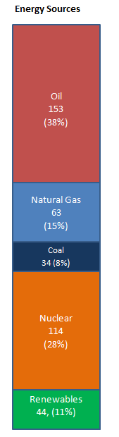
So let's take that closer look at that first energy supply column which is presented by itself below. There are two sets of numbers in each of column slices. The first is the total energy value, measured in trillions of BTUs, and the second is the percent of the total supply that comes from that fuel source.


In 2010 the total supply of energy to New Hampshire was 409 trillion BTUs. Working from the top and starting with the fossil fuels, it can seen that the biggest slice of the energy supply, 38%, comes from crude oil based fuels. The other two fossil fuels, natural gas and coal, furnish 15% and 8% of the state's needs, respectively. Overall fossil fuels provided 60% of the State's energy sources. Nuclear energy is an important component of NH's overall energy supply and represents about 28% of the overall amount. Renewables, which include hydroelectric, wood, waste and ethanol in gasoline, are an important 11% of NH's energy input. A small amount of electricity was purchased from out of state in 2010, but the amount is so small,  less than 0.5% of the total energy supply, that it was not included in these figures.


The following figure shows how New Hampshire's energy supply has changed over the past 50 years.


Some interesting points arise from this historical chart.
  • There has been impressive growth in the energy supply to the State. Energy supply as increased almost four fold - we have gone from 117 trillion BTUs in 1960 to 409 trillion in 2010. This is an annual growth rate of 2.5% per year compounded over 50 years which is very much lower than the equivalent 7.5% growth rate of the NH Gross State Product over the same period.
  • Since 1970 there has been relatively little change in the amount of oil based products supplied to the state. We will look at the reasons behind this in a future post.
  • Natural gas use has grown substantially over the past 20 years and its use has almost doubled over the past 10 years.
  • Except for some increases in the 1990s, coal use in the state has been fairly steady. However with large amounts of cheap natural gas available, I am anticipating decreases in NH's coal usage.
  • Since the commissioning of the Seabrook Nuclear plant in 1990 increasing amounts of nuclear energy have been added to the State's energy supply.
  • The renewable component of energy supply to the State, which largely comes from hydroelectricity and biomass, has not changed much since 1990.
So what are our main takeaways from all this information? Clearly there have been tremendous increases in the supply of energy to the state and, except for substantial increases in energy supplied by nuclear and natural gas, there has been relatively little change in the other components of the energy supply equation. We are still dependent on fossil fuels for 60% of our energy needs so, in some respects, the minor changes in the amount of energy from renewable resources could be viewed as disappointing.
 
What do these facts tell us about the future? Well it looks like nuclear is here to stay and, as long as natural gas remains cheap, the amount of coal burnt in NH should decrease, but we should not expect large amounts of renewable energy to come in and create a wholesale displacement of fossil fuels or nuclear. At this time, the economics and technology do not work. This is our state as well as our national energy reality.

Until next time, remember to turn off those lights when you leave the room.

Mike Mooiman
Franklin Pierce University


Wednesday, December 12, 2012

Welcome to the Energy in New Hamphire Blog


Greetings and welcome the "Energy in New Hampshire" blog. My name is Mike Mooiman and I am an Assistant Professor in the MBA program at Franklin Pierce University in New Hampshire. I am also the academic coordinator for our MBA in Energy and Sustainability Studies. This MBA program is now in its third year and as I have developed the program and worked to create classroom material, I started hunting down information about energy issues in New Hampshire as many of our students are from the local area and I wanted information that would be interesting and relevant to them.

Well, it turns out that “hunting” was the correct word. Good information about energy in New Hampshire is out there but, like hunting for deer, it can be difficult to find, it was not always clear what I was looking at and very often I came up empty handed. However, over time I started to pull together some interesting information from different sources and I decided it was time to share this information with the broader community via a blog. So in this blog I am going to publish, every few weeks or so, short articles on energy issues that are particularly relevant or specific to New Hampshire. Some of these posts will be analyses and overviews of existing information from different sources and others will be opinion pieces or findings that are a result of my understanding of and research into New Hampshire energy matters.

As in hunting, I am pretty confident that there will be times that I will, in my analysis and opinion, completely miss the target because I don’t have all the information but that is one of the joys of blogging. Through your comments and insights I will be able to correct and update the data and posts I have presented and over time build up a useful database of information about the energy situation in New Hampshire. So please do not be shy about commenting on my posts – I want your input and perspective.

Just a quick word about my background, I am an engineer by trade but have spent a good deal of my career managing and owning businesses. During these years I have always worked at the intersection of technology, finance and energy. I developed an early interest in designing new processes, working to make them energy efficient, and getting them funded on the basis of energy savings. The energy field has always appealed to me as it is one so vitally important to our economic well being as it stands squarely at the intersection of technology, finance and policy. Even if we don’t think about it much, energy and energy issues permeate our lives and daily activities. There is nothing we do that does not have some energy component to it.
In the process of putting together the new MBA program and preparing energy courses I have learned a great deal and I am looking, via this blog, to learn more and share it with you in the process. I have also had the good fortune over the past few years managed to meet some interesting people working on energy issues in New Hampshire. Over time I will share some of their stories and projects with you.
So welcome to “Energy in New Hampshire” and don’t be shy about weighing in.

Best wishes
Mike Mooiman
mooimanm@franklinpierce.edu